Aesthetic and Minimalist Design
Interfaces should not contain information that is irrelevant or rarely needed. Every extra unit of information in an interface competes with the relevant units of information and diminishes their relative visibility.
Problem
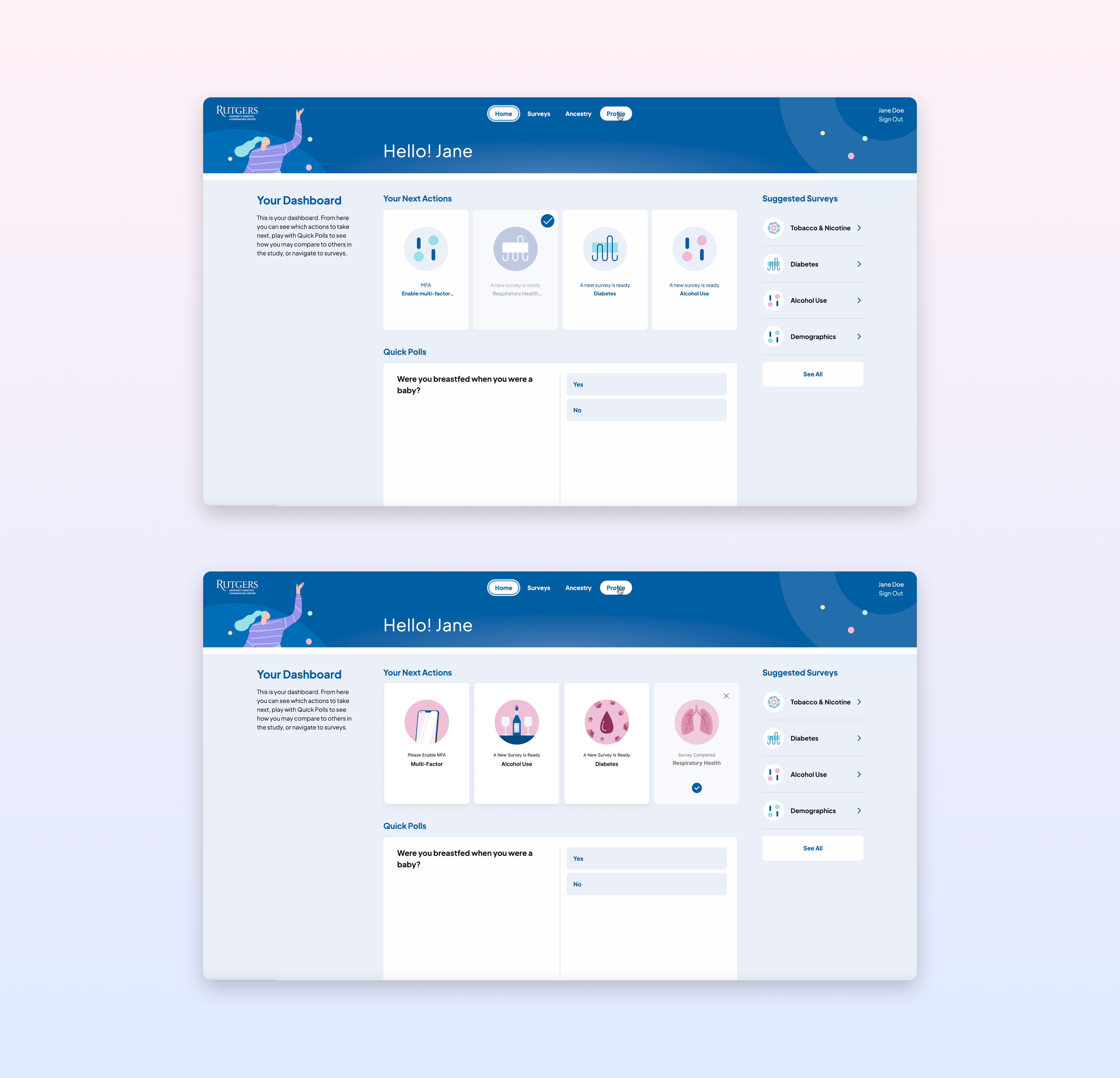
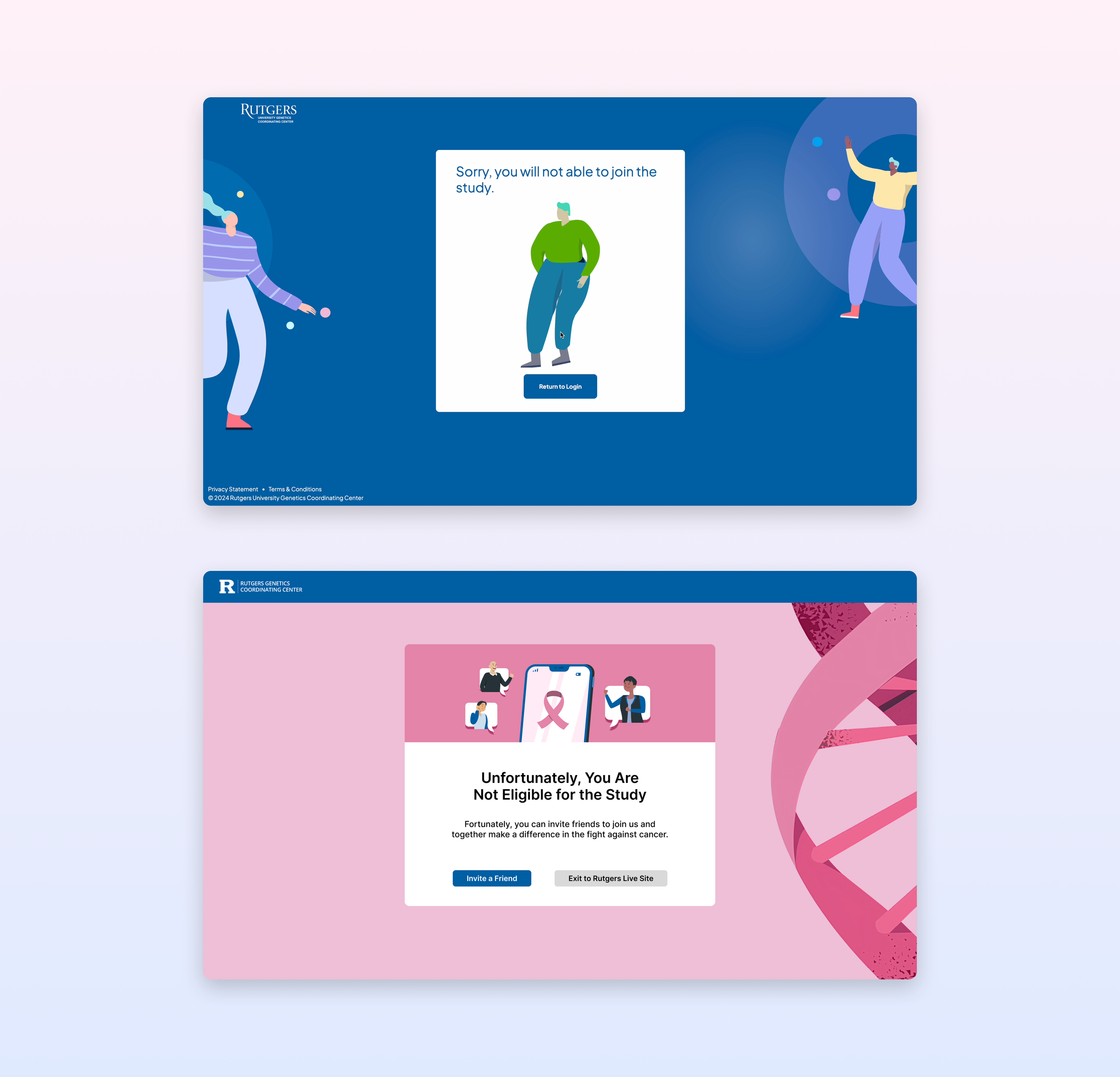
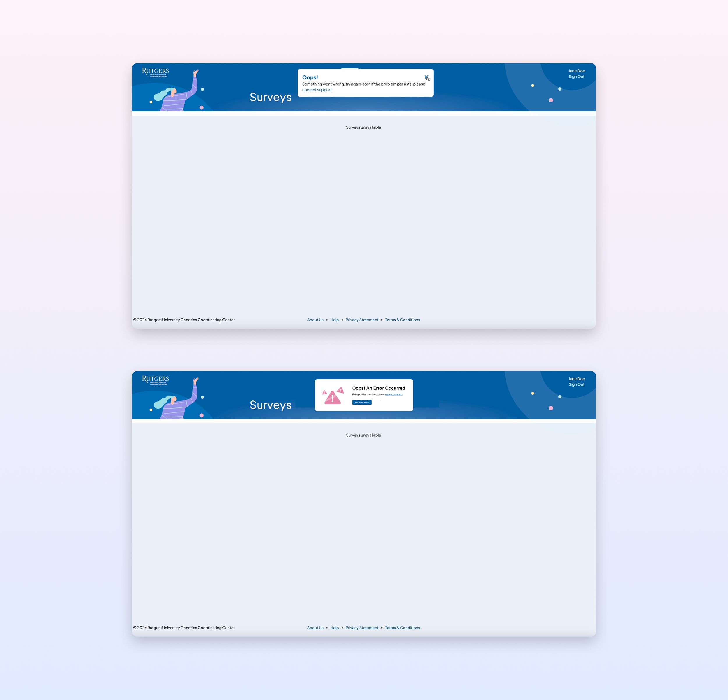
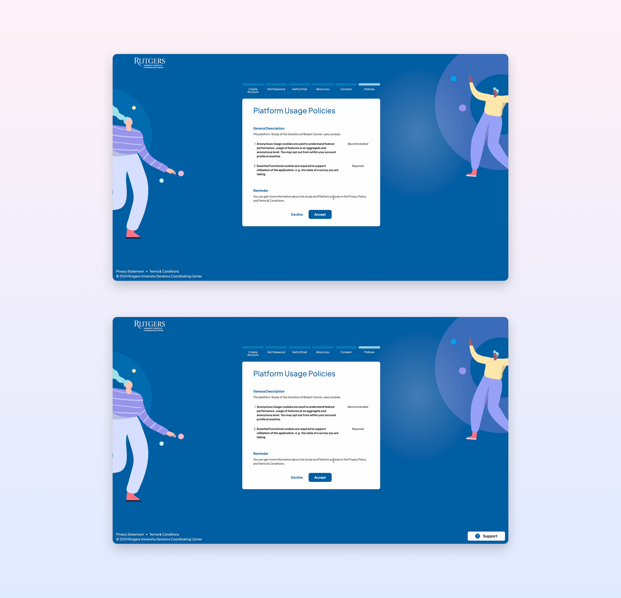
Overall, the website’s design feels vague, from its icons to its typography. It’s still in the earliest stages of development.
Severity Rating


Solution
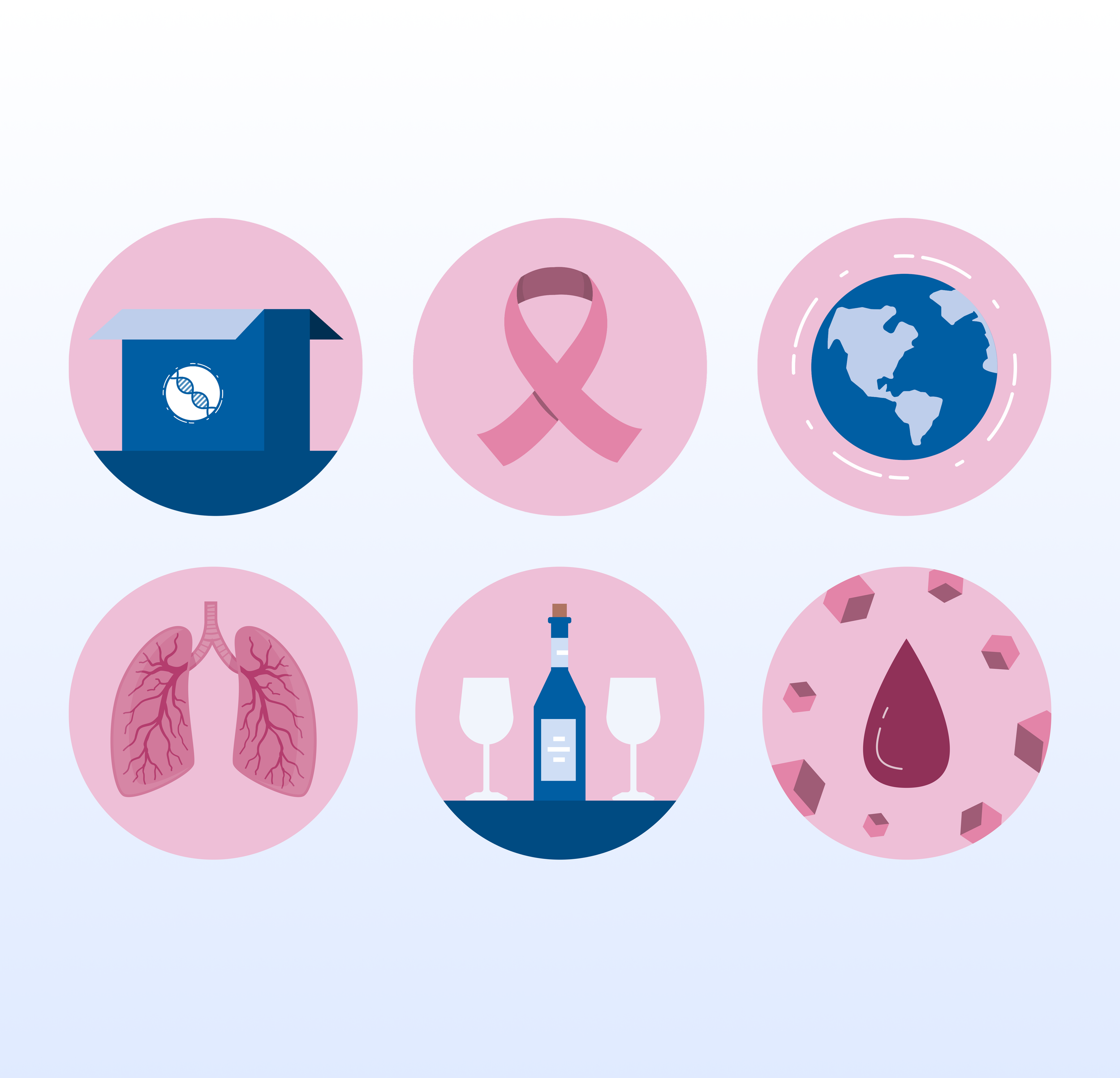
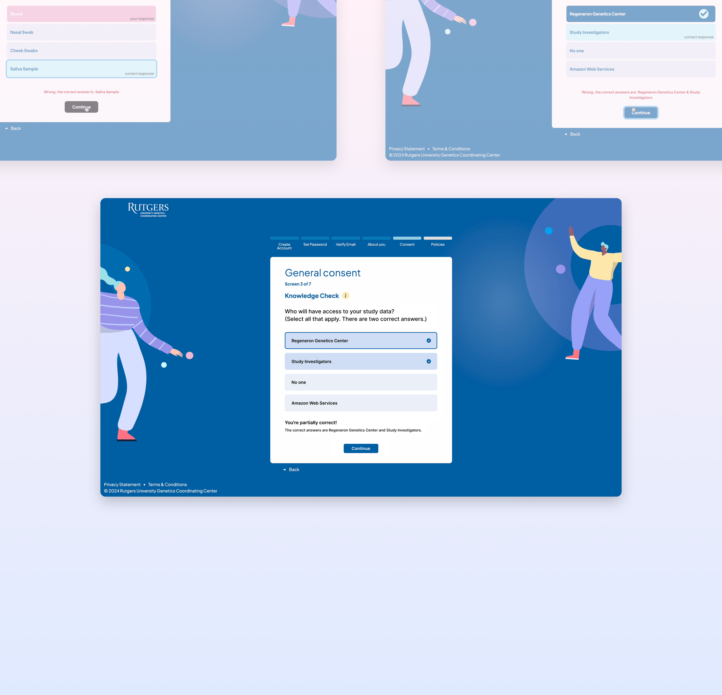
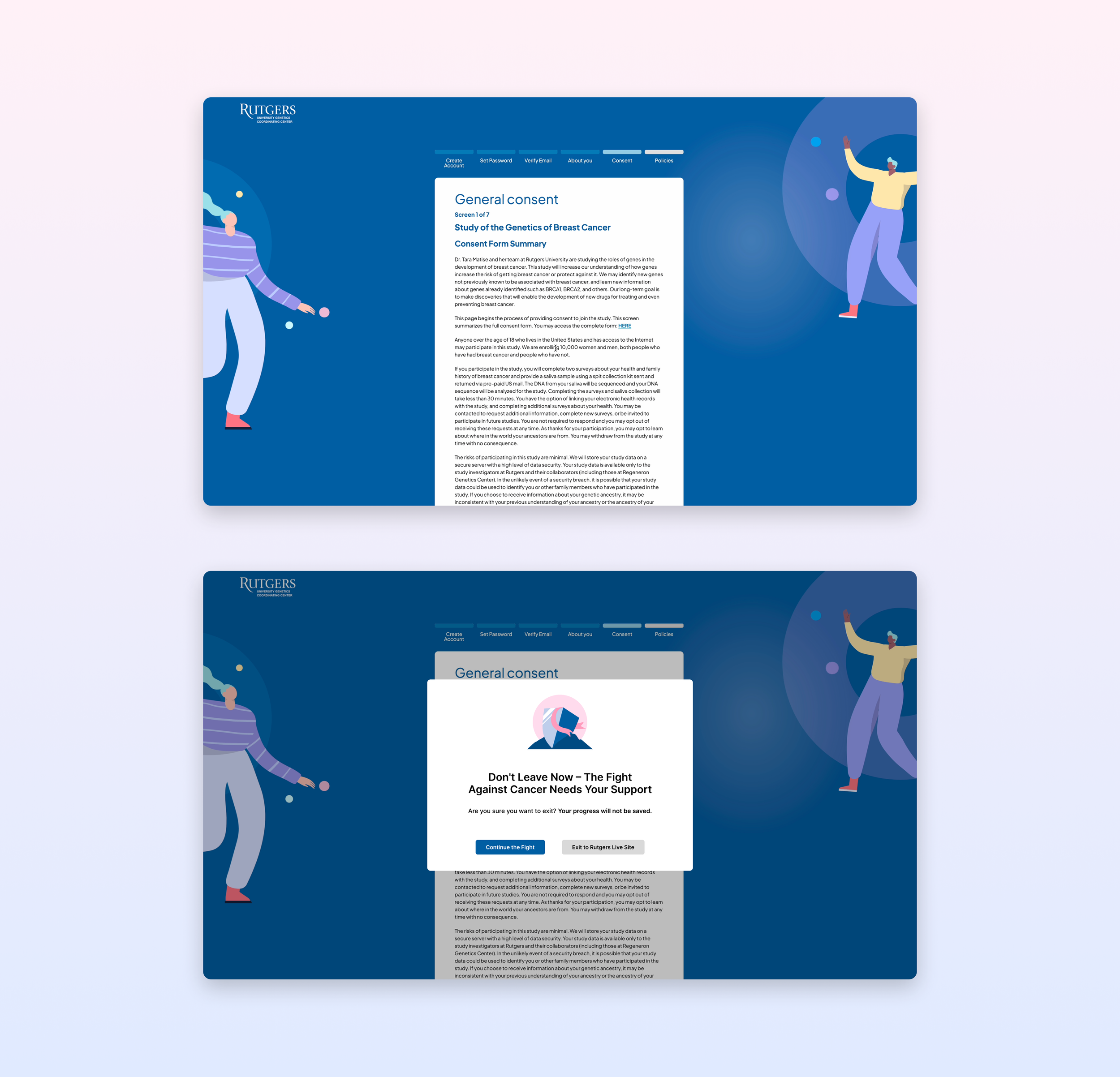
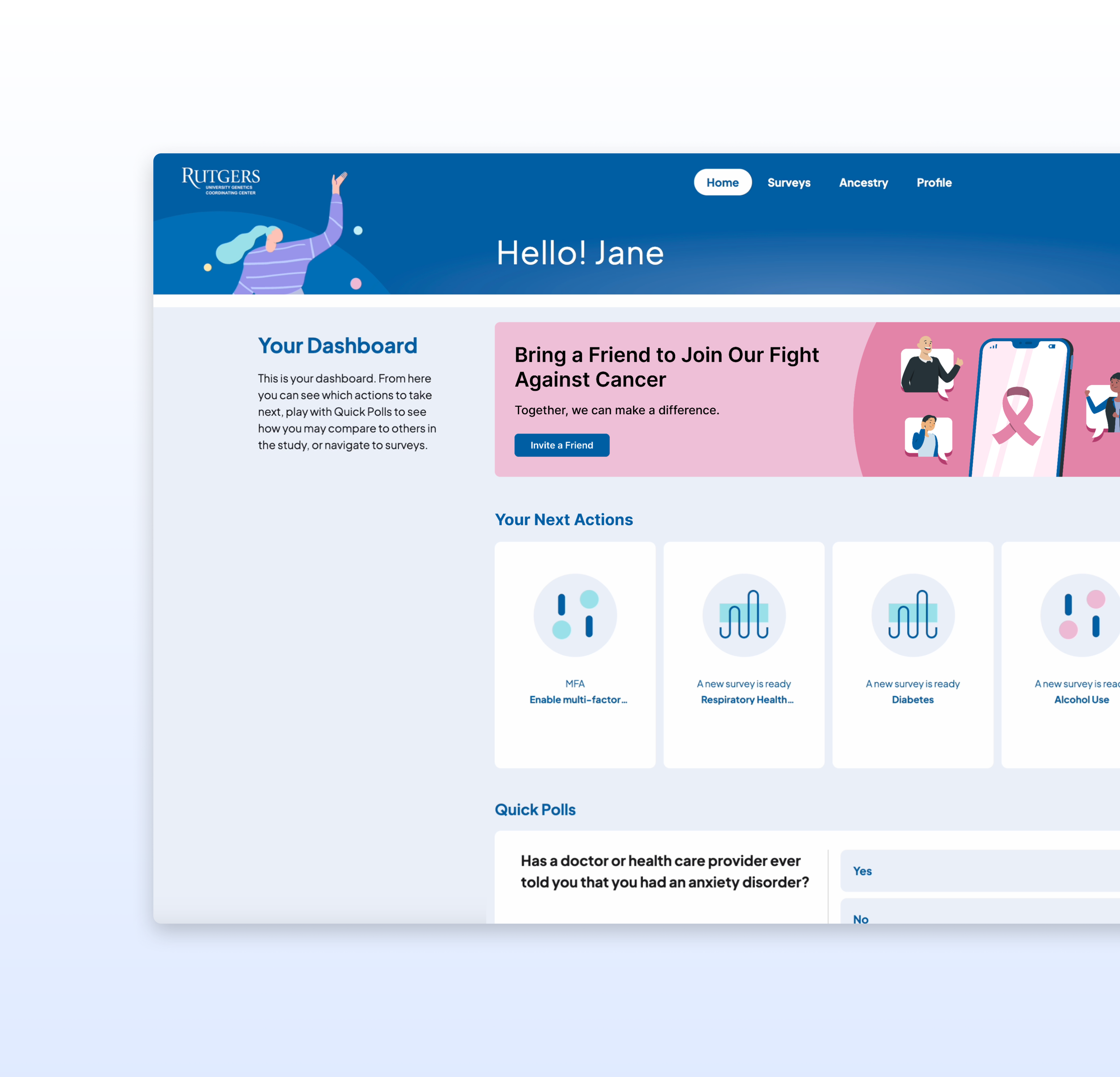
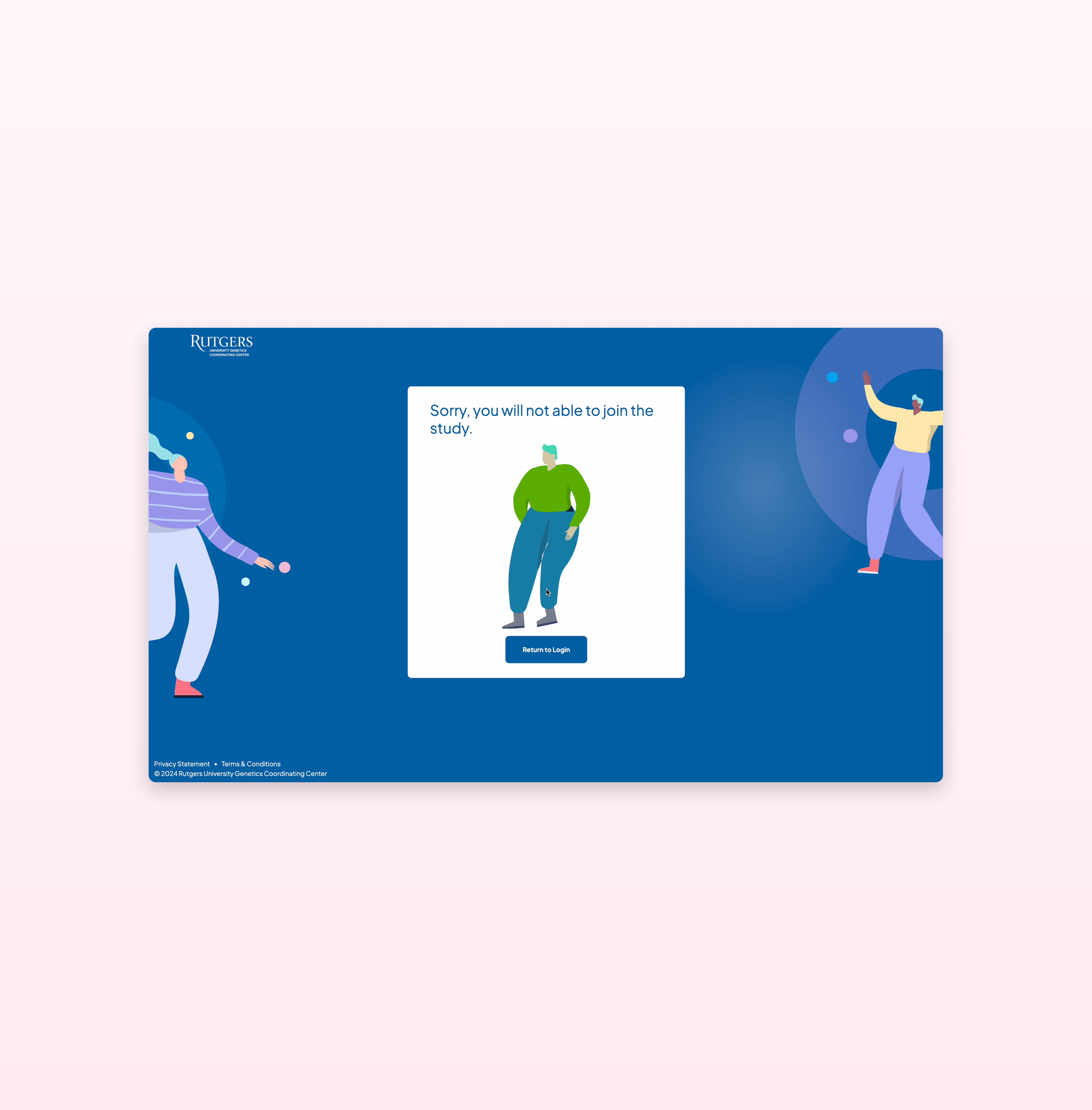
I redesigned the page to reflect the site’s new direction, incorporating the version 2 pink color palette and more descriptive icons.


