Match Between the System and the Real World
The design should speak the users' language. Use words, phrases, and concepts familiar to the user, rather than internal jargon.
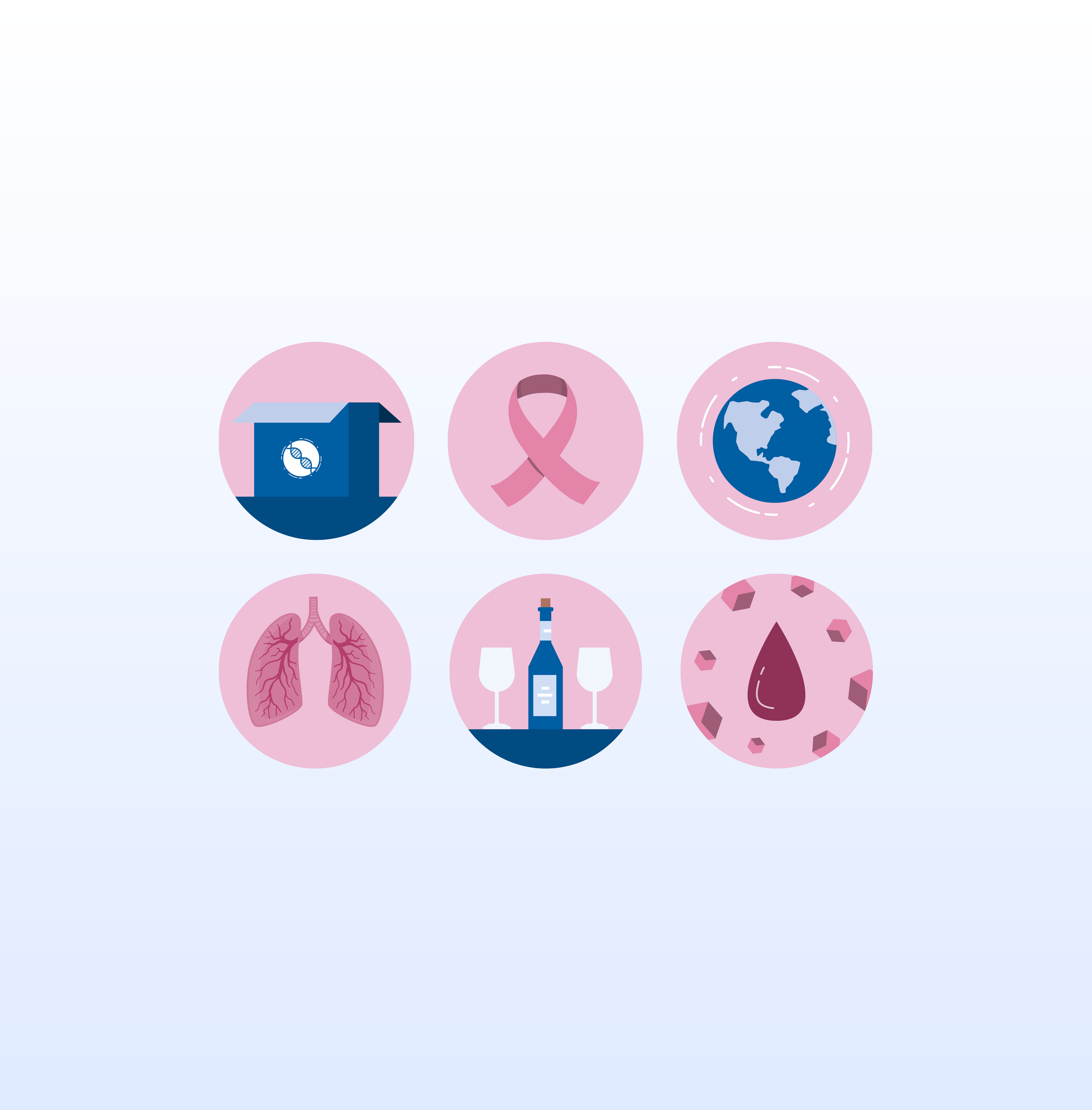
Problem
The icons throughout the application fail to clearly represent their functions. Accurate visual cues are essential, especially for users who depend on them for guidance.
Severity Rating

Solution
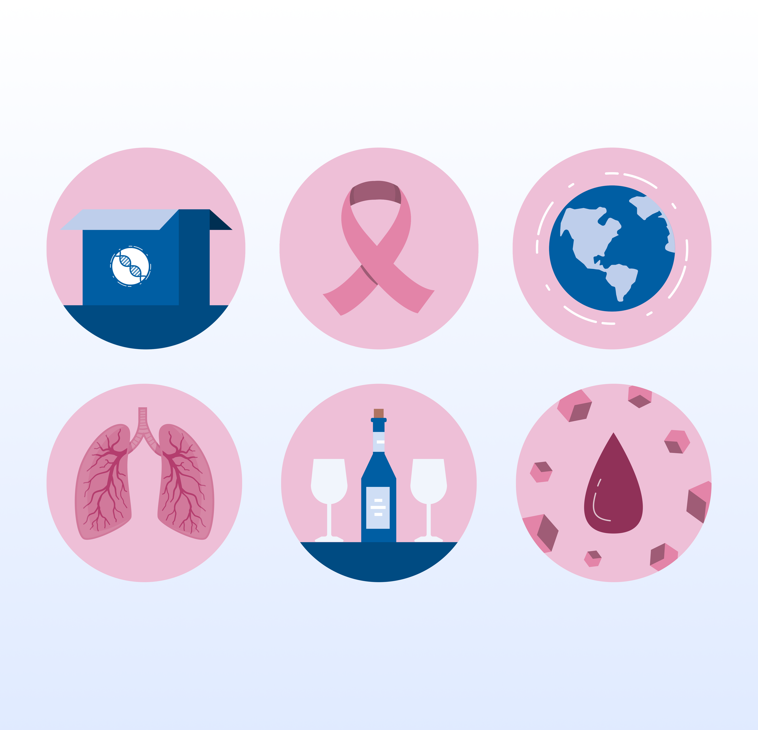
I created icons that match the subject matter to enhance user recognition and familiarity. For instance, using a pink ribbon for breast cancer is very recognizable for users.
-
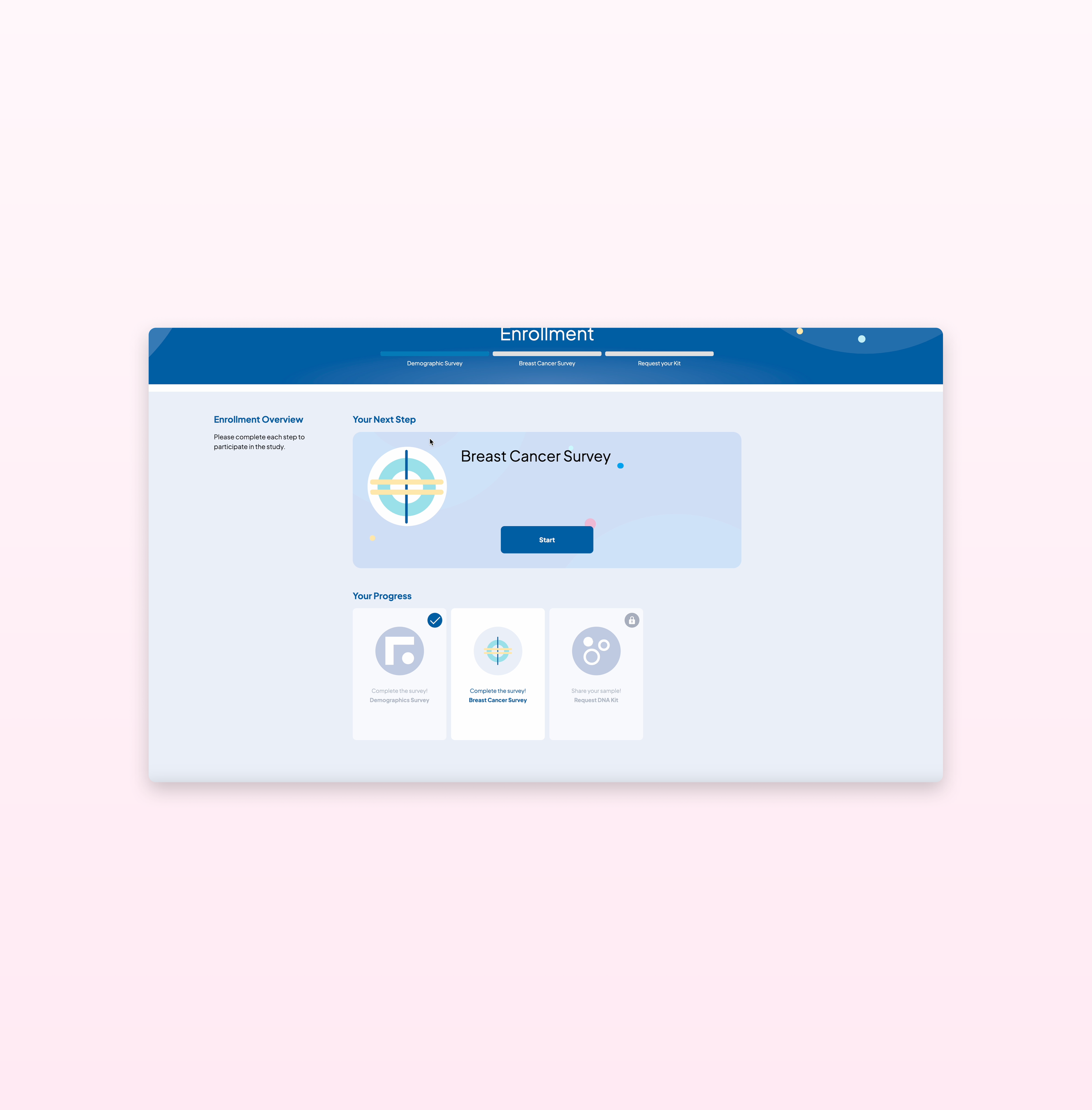
![Sequencing Screen Updated UX, Visibility of System Status]()
Visibility of System Status
The design should always keep users informed about what is going on, through appropriate feedback within a reasonable amount of time.
-
![Images of Icons related to Health, Breast Cancer, Sequencing]()
Match Between the System and the Real World
The design should speak the users' language. Use words, phrases, and concepts familiar to the user, rather than internal jargon.
-
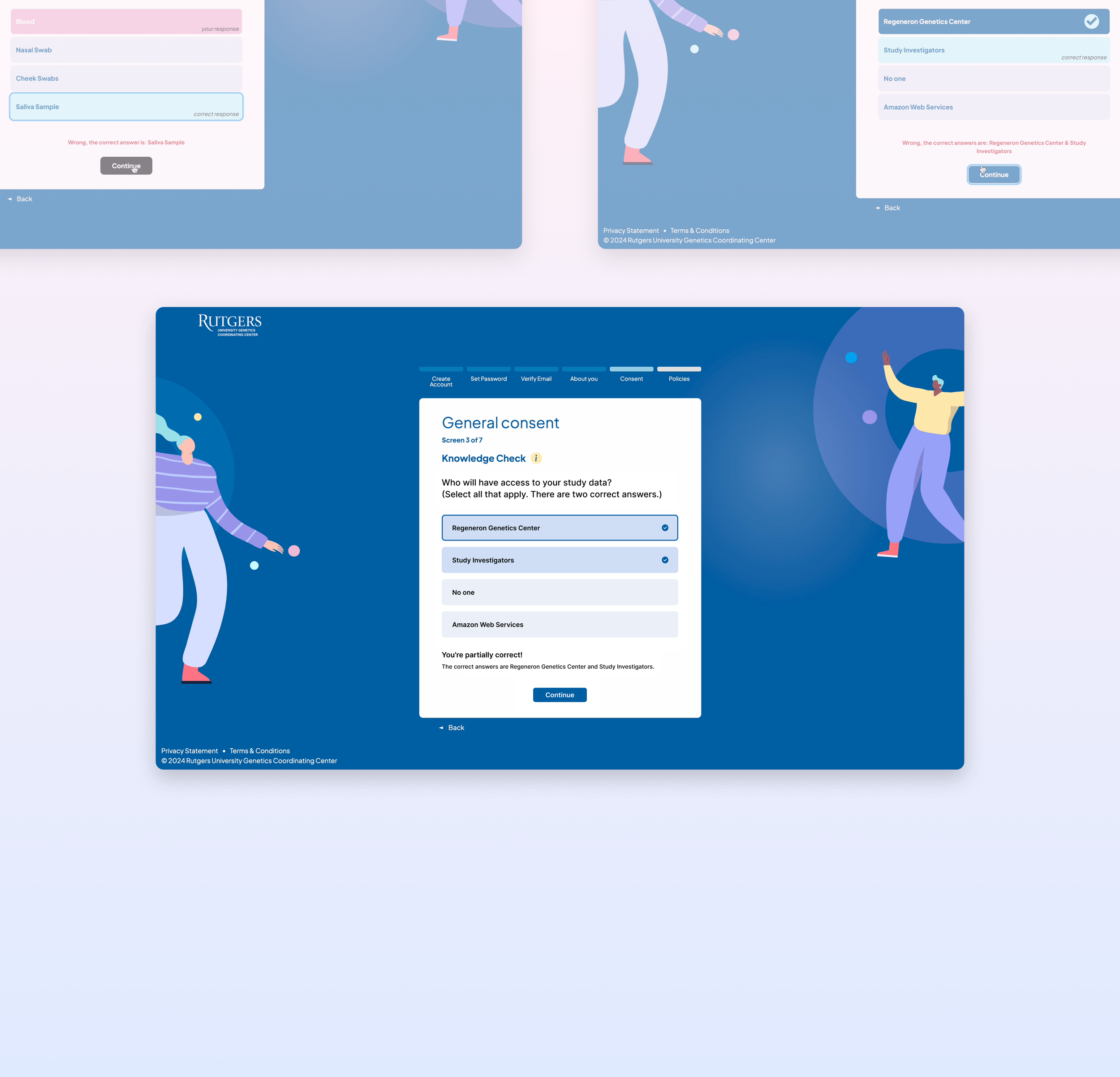
![Images of Survey Screens, User Control and Freedom]()
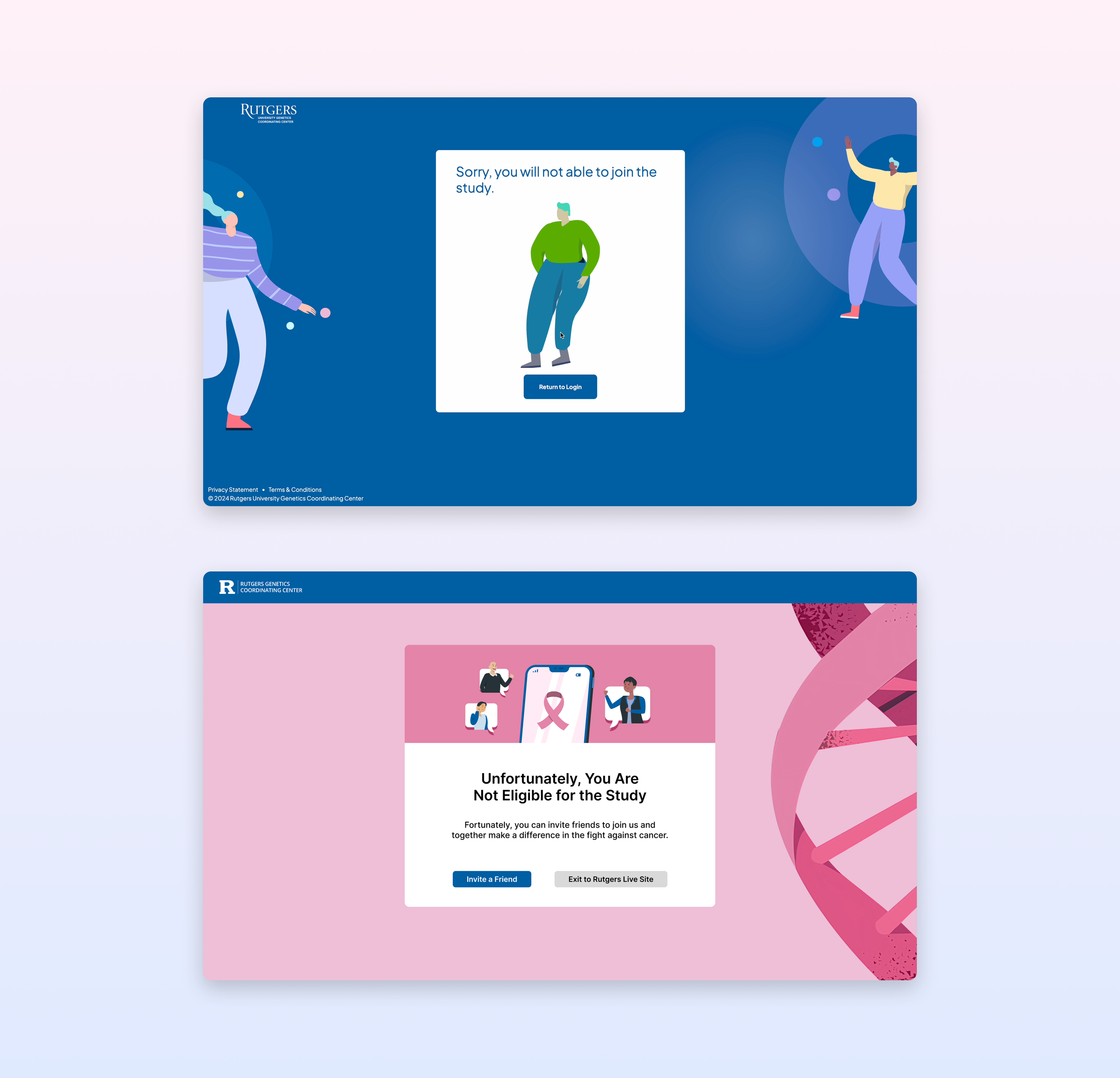
User Control and Freedom
Users often perform actions by mistake. They need a clearly marked "emergency exit" to leave the unwanted action without having to go through an extended process.
-
![Survey Screens, Consistency and Standards]()
Consistency and Standards
Users should not have to wonder whether different words, situations, or actions mean the same thing. Follow platform and industry conventions.
-
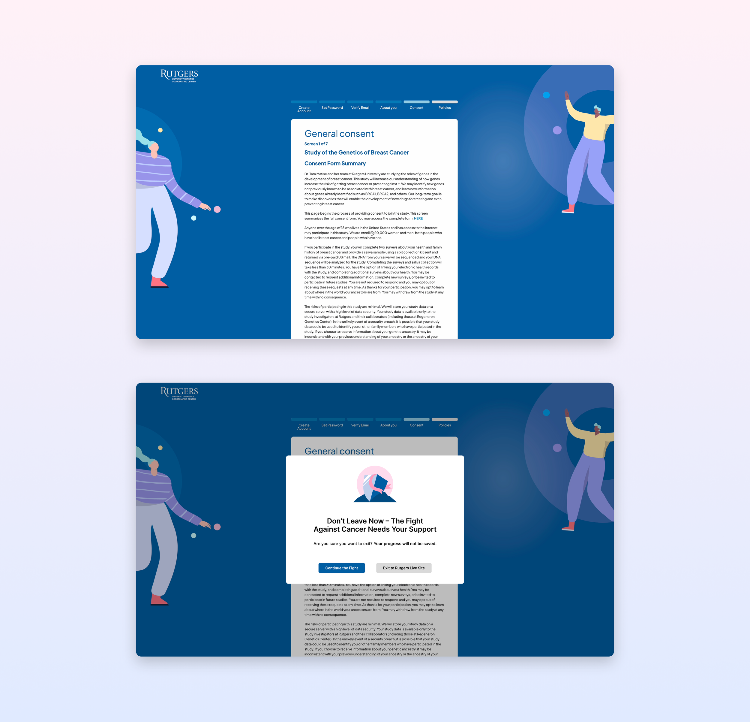
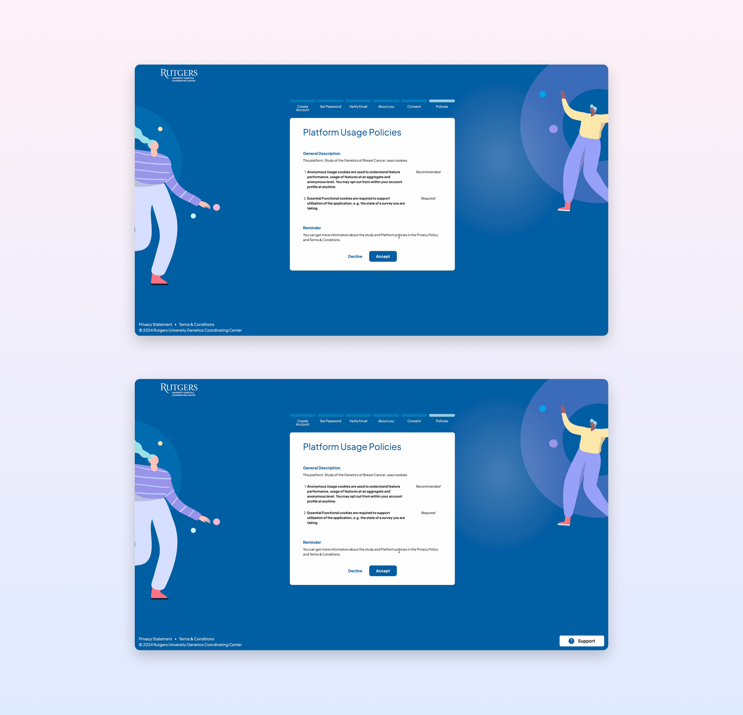
![Error Prevention Screens: Consent Forms and Popups]()
Error Prevention
Good error messages are important, but the best designs carefully prevent problems from occurring in the first place. Either eliminate error-prone conditions, or check for them and present users with a confirmation option before they commit to the action.
-
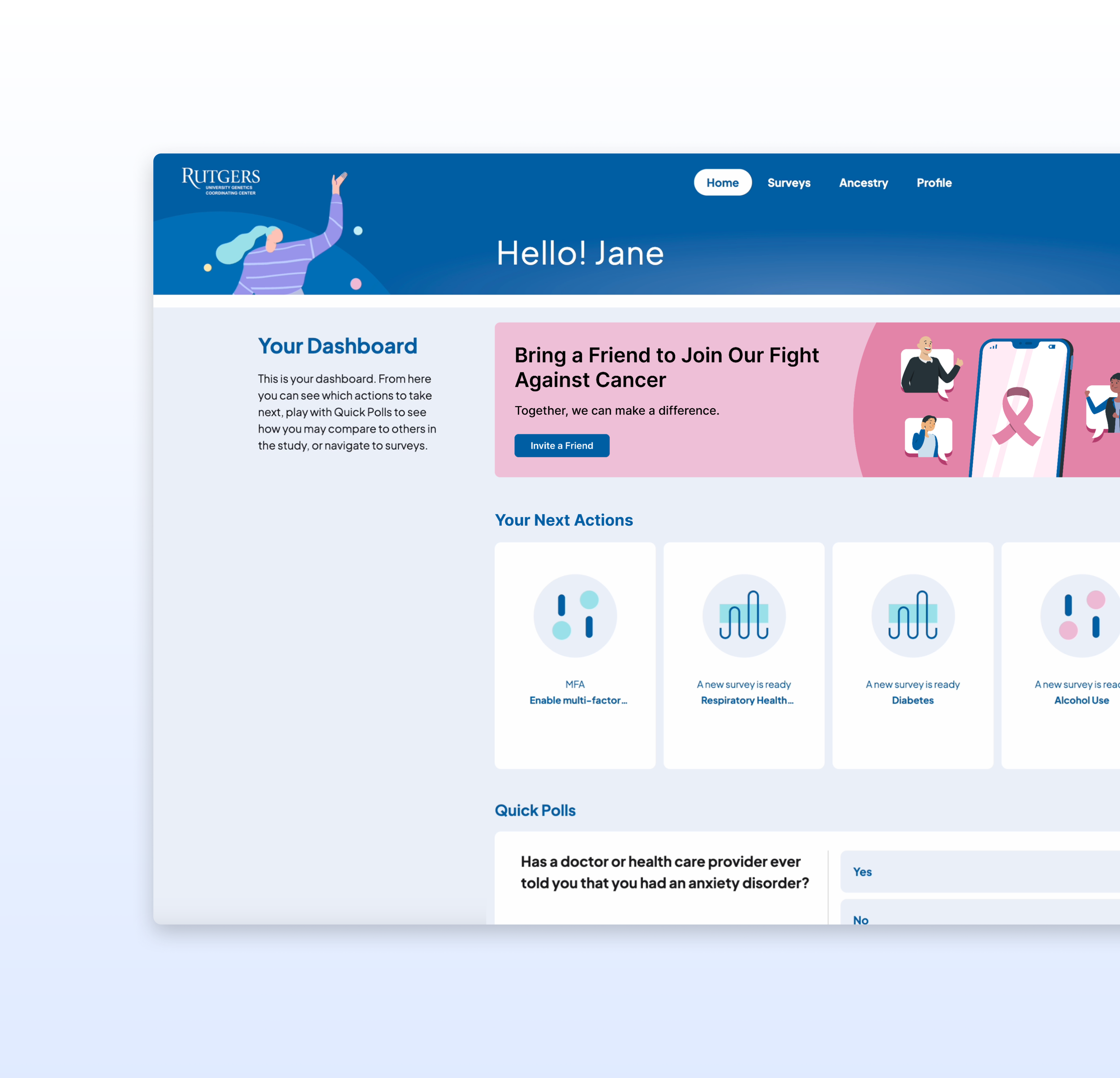
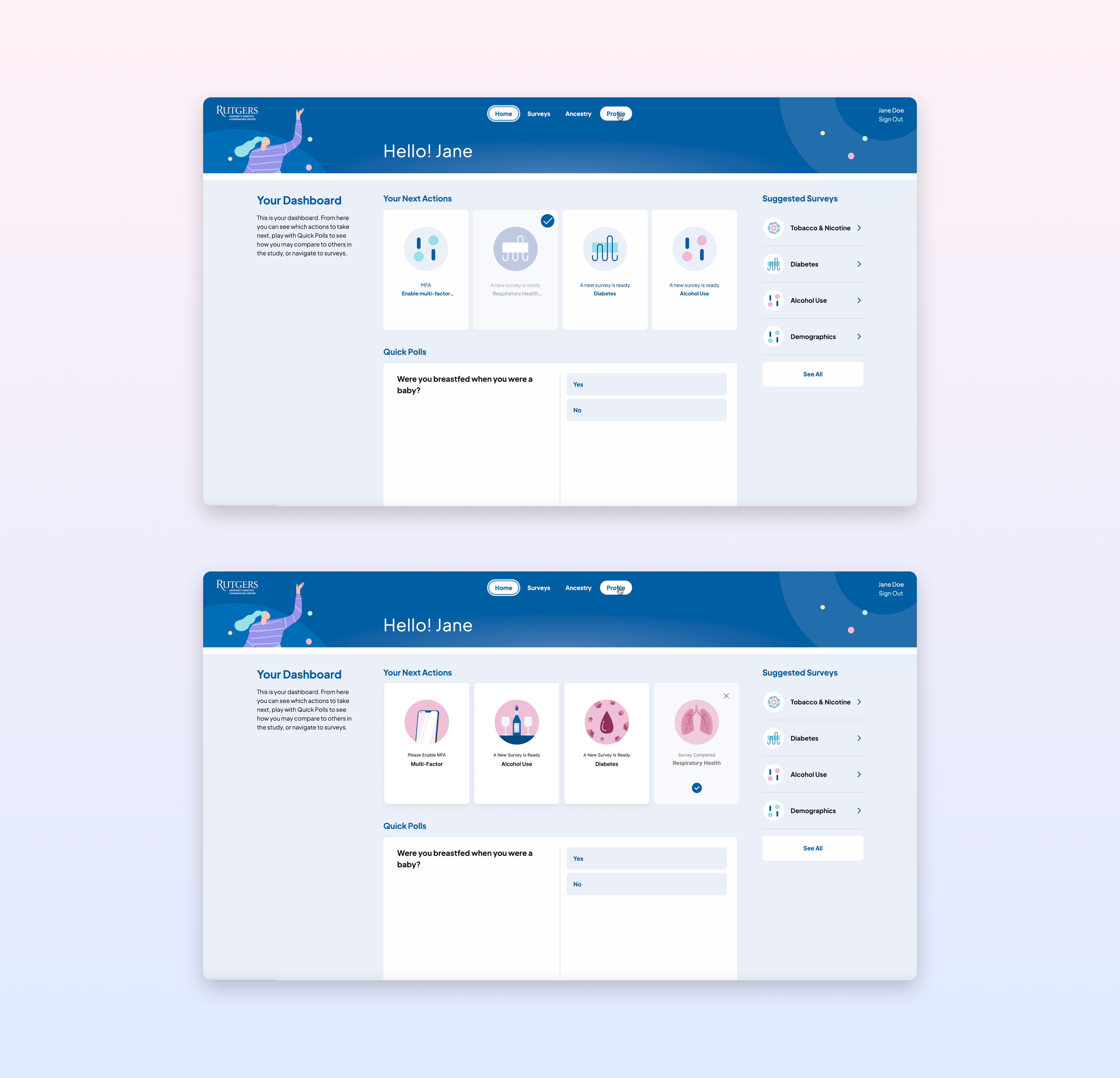
![Dashboard Page, Recognizable Widgets : Recognition Rather than Recall]()
Recognition Rather than Recall
Minimize the user's memory load by making elements, actions, and options visible. The user should not have to remember information from one part of the interface to another.
-
![Improved Dashboard Widgets: Flexibility and Efficiency of Use]()
Flexibility and Efficiency of Use
Shortcuts — hidden from novice users — may speed up the interaction for the expert user so that the design can cater to both inexperienced and experienced users. Allow users to tailor frequent actions.
-
![New Design for Project Screen: Aesthetic and Minimalist Design]()
Aesthetic and Minimalist Design
Interfaces should not contain information that is irrelevant or rarely needed. Every extra unit of information in an interface competes with the relevant units of information and diminishes their relative visibility.
-
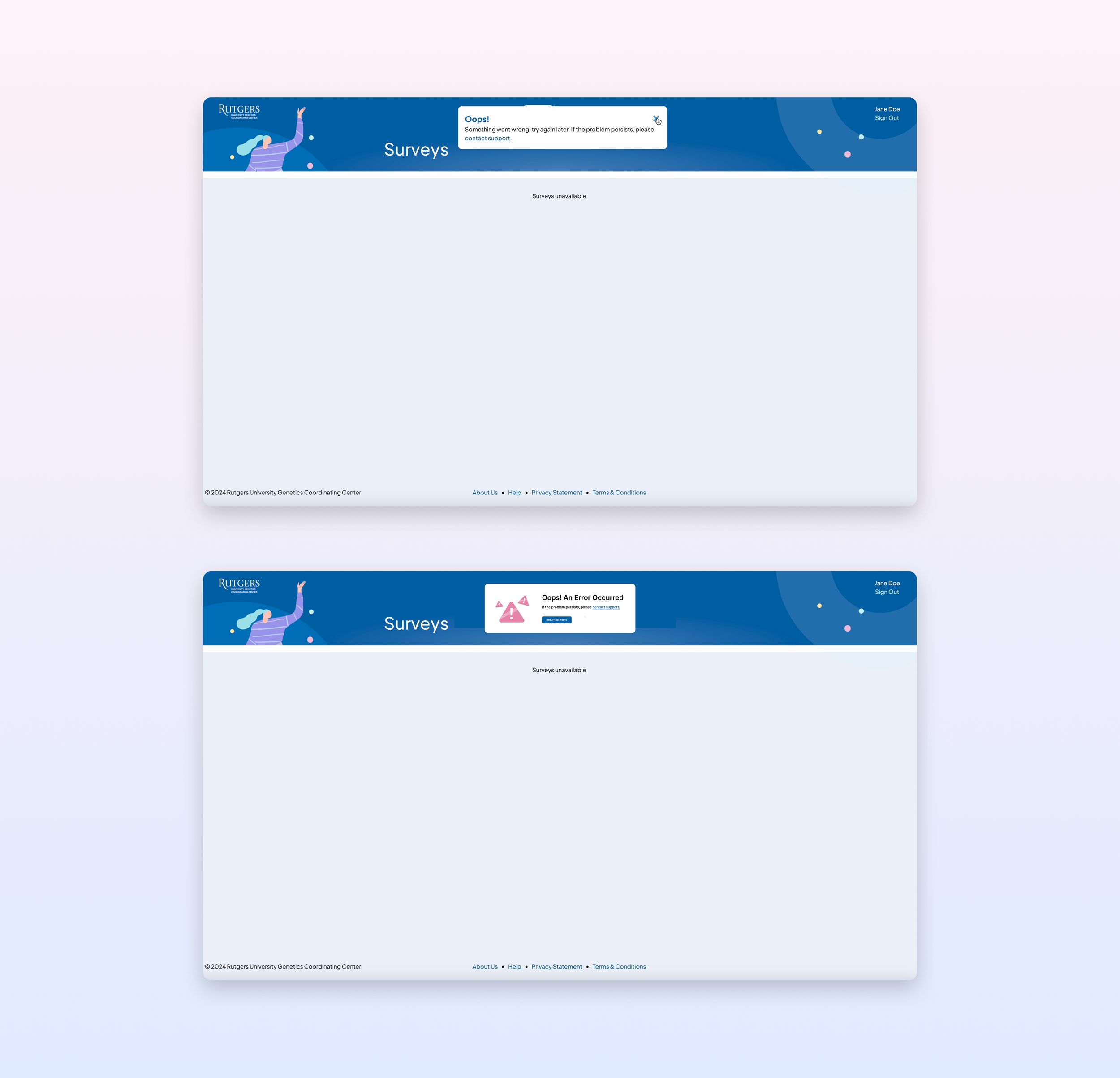
![Error Message Update: Help Users Recognize, Diagnose, and Recover from Errors]()
Help Users Recognize, Diagnose, and Recover from Errors
Error messages should be expressed in plain language (no error codes), precisely indicate the problem, and constructively suggest a solution.
-
![Screen Mockups, Support Button Update, Help and Documentation]()
Help and Documentation
It’s best if the system doesn’t need any additional explanation. However, it may be necessary to provide documentation to help users understand how to complete their tasks.
-
![Color Contrast Checker (WCAG Standards) Survey Screen]()
Web Accessibility
By adhering to Web Accessibility Standards, such as WCAG 2.1, designers can create inclusive experiences that benefit everyone.